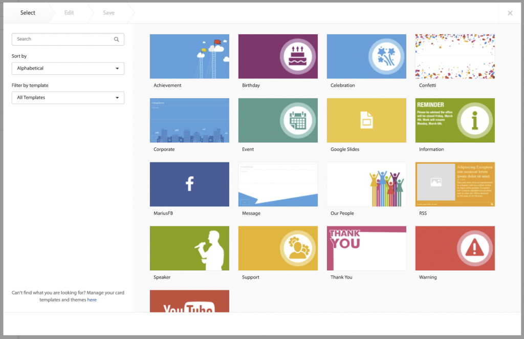
Card themes are a regular ask from Marketing (I know as I get asked all the time), so this weekend will see a host of new card themes accompanying our ac.14 update to public cloud.
If you’ve been living under a rock for the past few months, cards are a simple way to create brand-consistent communications in Appspace that automatically adapt to look great on TVs, computers, and mobile devices. If you are a brand owner, this dream of a feature enables you to standardize the look & feel of your company communications for each line of business and/or user group plus lock down fonts, colors, imagery, and more. This means no more losing sleep over when Jeff in accounting is going to start sprinkling his communications with a neon pink underline. #NotOnMyWatchJeff
Day-to-day, cards save lines of business valuable time in sharing content that drives awareness within the workforce. Messages are shared faster and without having to go through lengthy creative or IT processes. You can learn more about cards in our Knowledge Center.
To start with we’ve added some basic, but colorful, card themes to all public cloud accounts. These are a great starting point if you are getting started with cards or you simply want a basic structure to start customizing from.

Going forward we’re going to get even more generous with the card themes. Expect to see new card theme sets coming out over the coming weeks and each set is going to help with specific use cases, such as: event awareness, product promotion, employee on-boarding, crisis management, and many more. If you would like to see specific use cases covered in our card theme updates drop us a line at marketing@appspace.com